I’m almost ready to start concept art for my animation and I’ve found a few artists and works that I feel connect well with my story.
I began with a distinct interest in the work of Chris Sanders, I love the way he enlarges different parts of the body to emphasise the child like qualities of younger characters and the rounded style that he uses which adds to this effect. Here’s a link to his web comic Kiskaloo which contains good examples of where he exaggerates the parts of the physique that we associate with toddlers/babies in order to provoke an adoring reaction to his work.
http://kiskaloo.com/2008/07/april-7-2008/
Here’s another link to a sketch of his I found on Deviantart where the same style is used to a greater effect.
http://alohalilo.deviantart.com/art/Sketch-of-a-friend-107877826
I intend to draw attention to the innocence of the children and appearance of the doll in my film in contrast to the gruesome occurrences and lurking evil that resides with in the doll. As such I want to develop a style which emphasises both aspects. I consider the work of Chris Sanders to be a good starting point in achieving the cute side of my aesthetic.
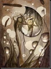
I’ve also been looking at the work of Daniela Jaglenka Terrazzini, an illustrator who uses mixed media, collage, computer software and a mostly sombre palette with strong accent colours to achieve eerie but enchanting images. Here are some examples of her work that I particularly like and a link to her webpage.
http://www.theartworksinc.com/folio/terrazzini/terrazzini.htm
These pieces have a strong sense of innocence and nature in contrast with darkness and corruption which I think ties in well with my story. I’m interested in the way she uses only one or two vibrant colours in a piece to draw the eye as I think this technique would work well in highlighting important aspects of my film such as the lipstick marks.
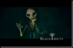
Additionally I’ve looked at Coraline, another film which uses a doll in a dark way, however in this film the doll never seems innocent. Here are some screen shots from the trailer.
I like the way dark colours are used to set the scene and the use of litter and the single metal frame bed in the second image which connote isolation and neglect.
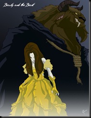
I have also been looking at the work of Jeffrey Thomas http://jeftoonportfolio.blogspot.com/ and I’m drawn to his “Twisted Princess” images. Here are a couple of examples.
The way he has used darker colours, filters and generally “twisted” Disney’s perfectly pure Princesses relates to the way I want to transform the orphans and doll in my film.
I also like the style he uses for “Red” (can be found on the website I’ve linked"), especially the way the the main character and blood stand out due to them being the only things with vibrant colours. Additionally I like the idea of using writing in the blood, it could be a good way to add to the communication of my story to the audience, although the message would have to be kept short and simple in order for the viewer to catch it.


